The museum has a collection of over 10,000 works of modern and contemporary art, although the exhibition space is relatively small. The building was completed in 1985, and was designed by architect Shozo Uchii.
Set in the tranquil urban oasis of Kinuta Park in Setagaya Ward, the Setagaya Art Museum is Uchii's attempt to house artworks in a structure which is both respectful of artworks and the natural environment within which the building is set.
When news of the plans to construct the museum became public in the 1980's, community groups quickly mobilized against the project, afraid that the presence of a large building in the midst of a public park would detract from the natural environment. In response to the outcry of the local people, the architect attempted to create a building which would harmonize as much as possible with its surrounding environment.
Uchii's point of departure for creating a nature-friendly museum was his choice of the wave as the inspirational form for the project. He felt that the wave pattern is a naturally harmonious and relaxing form as well as one which often appears in traditional Japanese design. By utilizing the wave pattern, a structure could be created within the context of traditional Japanese design which would be visually comfortable to the mostly Japanese visitors as well as harmonious with the surrounding verdant environment.
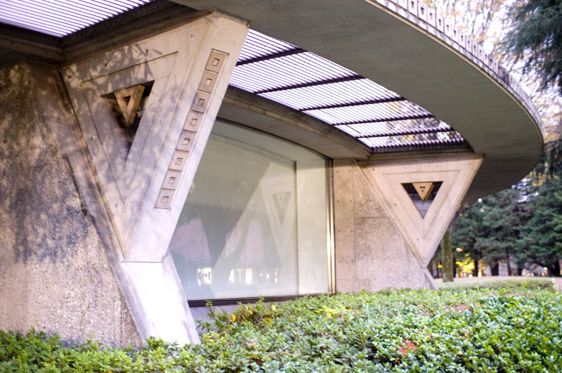
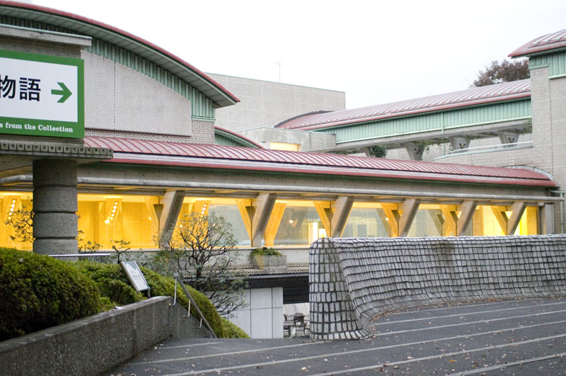
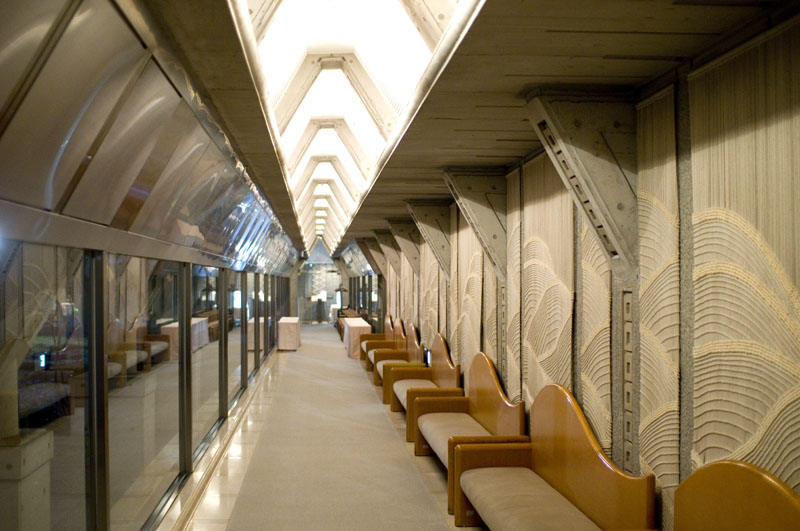
Although the use of the wave pattern may not be immediately discernible to the casual observer, it is in fact almost ubiquitous. It is responsible for the flattened arch shape of the roofs of the structure as well as the inspiration for textiles, furniture and fittings within the building.
Other elements of the design also contribute to the architect's desire to make the building a non-intrusive presence in a park setting. The first of these is the decision to keep the structure low-rise. At its highest points, the building never rises above the height of the trees around it. Another is the pergola which wraps around much of the building. Interwoven structure and vines combine to create a transition space which is both architectural and natural.
The textured walls of the building's exterior are one of the structure's most interesting and creative aspects. The walls are formed from square cement tiles each with an indented section at the center. In a process created be the architect, the surface of each tile was sandblasted in order to give it a rougher, more natural texture. This texture, combined with the wide joist used between the tiles, gives the exterior surface of the building a soft, warm quality which is rarely achieved in concrete. The overall effect brings to mind the textured stone walls of Mayan ruins or the walls of Frank Lloyd Wright's Los Angeles homes.
At the center of the museum lies an open courtyard located below ground level. It is bounded on one side by a cascade waterfall in a curving shape which is reminiscent of the snake-like forms used by Antoni Gaudi. Like the pergola which surrounds most of the structure on ground level, the waterfall serves as another transition point between the natural environment and the ninety degree angles of the building. The other three walls of the courtyard, covered in stone, echo the sound of the waterfall. The end result is an outdoor space in which the sounds of voices from the surrounding park are drowned out and one can spend a relaxing hour reading or talking.
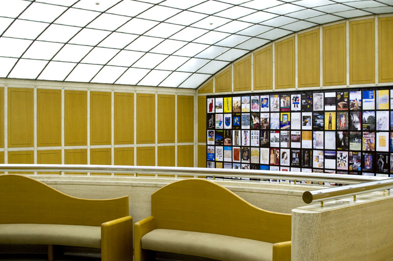
The building's interior does not quite live up to the restrained elegance of its exterior. Inside, the architect has provided the museum with an ample amount of exhibition space, as well as a small theater and art library. The repeated use of the wave motif is at times overdone and the choice of surface materials such as the cream marble and oak stained wood of the entrance hall often seem to be in conflict with each other.
Uchii sees himself as an architect firmly rooted in the Japanese tradition. He embraces the traditional Japanese high regard for aesthetics and spirituality as well as traditional Japanese visual forms. In his attempt to create a pleasing environment in which to view art he has drawn mostly from these traditions. It is interesting to note, however, that the end result is a structure in which one can easily find many elements of modernism and European classicism as well as the solid forms of ancient architectural styles. In this sense it is a design which transcends temporal and geographic boundaries. It is an eloquent expression of our age, a period in which the rapid exchange of information has brought previously segregated cultures together.
by Max Bolstad


